The enduring concept of the cubicle has finally found its moment after more than 50 years. Originally designed in the late 1960s as a solution to the lack of privacy and excessive noise in open-plan offices, the semi-walled workstation aimed to strike a balance between personal space and connection to the surrounding environment. Despite its promising intentions, the execution often left employees feeling isolated in a monotonous sea of cubes.
However, in the current post-pandemic era, where workplaces are experiencing a shift towards hybrid work models and half-filled offices filled with video call chatter, the allure of even a partially private space has gained significant appeal. Companies, office designers, and furniture manufacturers are now recognizing that the underlying principles of the cubicle hold great relevance in the modern work landscape.
Consequently, new iterations of cubicles are emerging, with designers reevaluating and revitalizing the concept to better align with the unprecedented conditions and evolving work habits of today's workforce. This reconsideration of the workstation has been prompted by the pandemic, compelling stakeholders to explore ways in which the cubicles of 2023 can ultimately achieve the original intentions of their predecessors.
The birth of the cubicle can be traced back to the visionary thinking of Robert Propst, the president of Herman Miller Research Corp. in the 1960s. In his book "The Office: A Facility Based on Change," published in 1968, Propst lamented the outdated office environments that failed to keep pace with evolving technologies, industries, and work patterns.
As the research director for Herman Miller, Propst proposed a solution in the form of a redesign of the existing concept called the Action Office, which he had developed with the company's design director, George Nelson, in 1964. The Action Office consisted of a set of interchangeable desks, shelving units, and cubby-like stations, offering a more customizable seating system in contrast to the traditional open floor plans with uniform desks.
The subsequent redesign, known as Action Office 2, introduced walls to these elements, enabling them to be combined and configured into discrete and private workstations according to individual preferences. Propst emphasized that this system allowed users to adjust and adapt their workspaces to suit their needs and evolving work requirements.
This innovative workstation solution eventually came to be recognized as the cubicle, a dominant feature in office design for over 55 years. Open office spaces have been subdivided using variations of the original Action Office concept, along with numerous reinterpretations, imitations, and adaptations.
Despite its original intentions, the cubicle system has largely failed to fulfill Robert Propst's vision of a flexible and adaptable furniture solution. Instead of offering versatile options that can easily adapt to changing times, most iterations of cubicles ended up as repetitive and uninspiring three-walled cubes, causing frustration and boredom for office workers worldwide. The dynamic and vibrant workplace that Propst had envisioned in 1968 transformed into a monotonous and draining environment.
As we enter the 2020s, this outdated design approach becomes even more disconnected from the evolving needs and preferences of modern workers. After experiencing years of remote work during the pandemic, employees have become selective about their return to the office, and companies understand the importance of creating attractive work environments to attract and retain talent. The traditional room filled with 1960s-style cubicles no longer meets these expectations.
Fortunately, the surge in remote work caused by the pandemic has provided designers of offices and office furniture with a fresh perspective. Rather than pushing people away from physical offices entirely, the shift in work dynamics has redefined the expectations of what an office space should be.
Many individuals discovered that their home workspaces didn't need to encompass every aspect of their work life. They became accustomed to the flexibility of working from different locations within their homes, apartments, or even their cities. This realization has opened up new opportunities for office designers, encouraging them to reconsider and redefine the concept of the workplace.
The traditional notion of employees walking directly into their personal office, desk, or cubicle upon entering an office building is becoming increasingly rare. The experience of finding alternative spaces to work during the pandemic has sparked newfound creativity in how people approach their work environments. This shift in mindset has expanded the definition of what can be considered a suitable place to attend meetings, respond to emails, or work on presentations. As employees return to the office, there is a growing willingness to explore more flexible and mobile work arrangements.
In response to this shift, designers and office furniture manufacturers have begun to diversify their offerings beyond traditional desks, chairs, and cubicles. They are now incorporating a broader range of furniture and spaces to accommodate different work styles, promote collaboration, and facilitate hybrid meetings. This trend was prominently showcased at NeoCon 2023, a renowned commercial and interior design conference held annually in Chicago. The pandemic has served as a catalyst for workplace design innovation, providing a clear glimpse into the future of work. Manufacturers are now actively addressing the challenges of creating work environments that foster in-person collaboration while effectively integrating hybrid workers in meetings and activities.
A promising design solution in the realm of flexible workstations is Gradient, a workstation system developed by office furniture manufacturer Pair in collaboration with product design consultant Gensler. This modular system introduces a basic frame system that supports adjustable-height desks, tables, dividing-wall panels, and storage cabinets. The versatility of Gradient lies in its ability to combine these components in a multitude of layouts. For instance, a cubicle desk can sit alongside a collaboration table or a diner-style booth at the end of an L-shaped arrangement of library-inspired reading desks. This adaptable kit of parts provides a range of possibilities for creating dynamic and functional workspaces tailored to the specific needs and preferences of individuals and teams.
“Systems furniture always promised to be flexible and adaptable and change with you as a company. It very rarely ever was,” says Schump, who worked on the Gradient project. Those systems were difficult to reconfigure without a team of workers and often required a significant amount of storage space for extra parts if walls needed to come down or shelves needed to go up. Gradient was designed to use as few types of parts as possible, accommodate a range of behaviors, and not require a warehouse for storage, or a team of installers to make a change.
“It can be a box if that’s what you need. It can be straight, individual desk benching,” says Kelly Dubisar, design director and principal at Gensler. “The beauty is, as designers and clients, you can take the footprint of the product and you can start to turn it, you can start to take out a desk and insert a collaborative table.”

The system’s flexibility derives from its modular-framing system, which is mostly visible. “A lot of systems out there have internal components that come together and then skins and sheet-metal pieces that all hook and hang and clad,” says Pair’s design engineering manager, Eliot Whalen. “Our approach to it was to celebrate the internal workings of the frame and the support system and make that a design element, in a way. Not being afraid to show the frame exposed in the open environment.”
The other parts simply attach to the frame, whether dividing screens, wall panels, shared storage cabinets, or tables and work surfaces at varying heights. “The landscape can really start to become much more interesting and varied across an open office,” Dubisar says.
Pair is seeing this concept catch on across a range of industries. Clients for the Gradient system so far run from banks to bioscience to education to tech companies. The materials and finishes of the component parts can be customized, dialing down the color for a more buttoned-up bank, or adding a brighter mix of panel finishes for a tech company. “That’s incredibly interesting from an aesthetics standpoint,” Dubisar says.
And if a company’s aesthetic changes, or its workers need a new kind of office configuration, Gradient is designed to easily adapt. “What you might think of today as your open-office configuration can morph and adjust over time,” says Dubisar. “As your business needs change and your employee base starts to work differently, you don’t have to throw everything out. It can work with you and grow with you.”
Other cubicle-like designs are also applying the lessons learned during the pandemic. Form Us With Love, a Stockholm-based design firm created a workstation system for Danish furniture maker Plus Halle that is office agnostic.

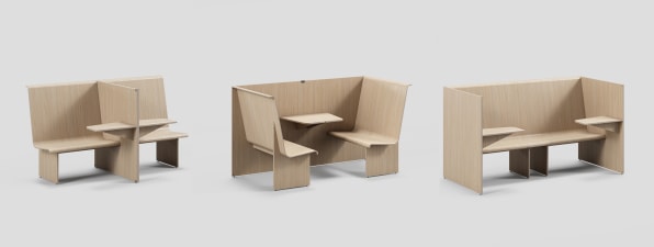
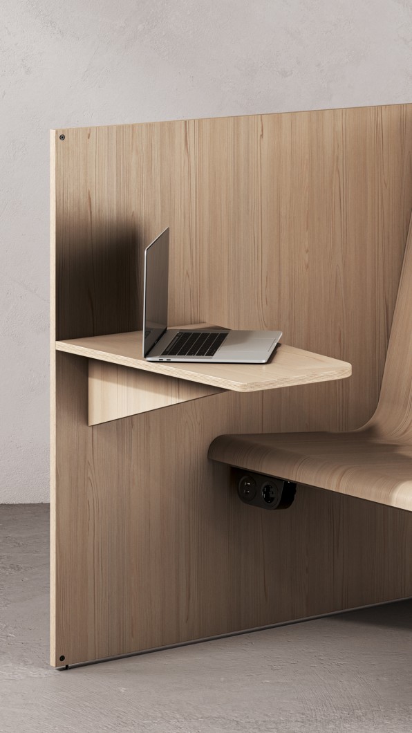
Understanding that work often happens on the go or in interstitial spaces like hotel lobbies or train station waiting areas, Form Us With Love created a simple pressed-plywood bench, tabletop, and wall system that can be combined in various formations. Looking a bit like a seat and compact table one might find in a fast food restaurant, the workstation—named Cubicle—is a building block for creating individual workstations, cross-table meeting booths, or rows of spaces where someone might spend 10 minutes on a phone call or an hour responding to email.
Form Us With Love co-founder Jonas Pettersson says the Cubicle system is intended to inject working spaces into the non-office places people often find themselves needing to get a bit of work done or have an informal meeting, like a hotel lobby or the entrance of a company headquarters. “Everyone is looking for the space where people can naturally meet or sit down for a phone meeting,” he says.

Flexibility was a key design goal, according to John Löfgren, the firm’s other co-founder. Thinking about the post-pandemic work environment, he says the design developed as a counterpoint to the rigid offices that many people were either forced to leave or uninterested in returning to. And while the design takes Cubicle as its name, the workstation isn’t intended to ape the walls and seclusion of the classic cube.

“We discussed a lot how high things should feel. I’m in a secluded environment, but I’m definitely not enclosed,” Löfgren says. “It was kind of a hybrid. Something that had benchlike properties and definitely no doors.”
For all the informal workspaces these new types of cubicles are designed to function within, sometimes workstations still need to be in a sorta boring, sorta unappealing, actual old-school office. That doesn’t mean they have to be bad, though.
The office furniture maker KI worked closely with Facebook parent company Meta during the late pandemic to develop a new kind of workstation. With an expectation that workers would eventually be called on to come back and work in the office on a full-time basis, the company wanted a design that would be appealing to its employees while also accounting for the new hybrid physical-digital ways people work.

Jonathan Webb is KI’s director of workplace, and he says the goals of the project for Meta boiled down to two very pandemic-related requirements: the workstation had to be a good place to do a video call, and it had to block the noise of an office full of people doing video calls.
“Those are the conversations we’re having every day with all sorts of clients all around the country. It’s how do we improve and enhance the video conference experience, and how do we deal with acoustics,” Webb says.

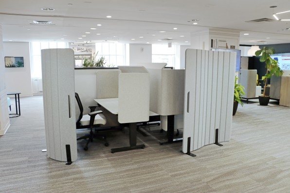
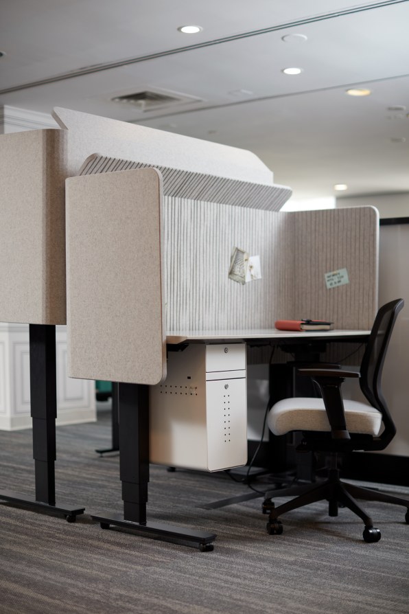
The Meta project—named Cubes—consists of a series of moveable and bendable felt-like wall panels, each capable of providing a noise-blocking barrier or a subtle background screen for those on camera. Meta is technically the designer of the project, and KI is the manufacturer of what it considers a co-creation. Webb says internal testing showed the panels reduced noise by 24 decibels. That’s like turning an alarm clock noise down to the level of a normal conversation, or a normal conversation down to a speechless library. “That’s a considerable reduction in noise movement from one area to another,” he says.

Webb says KI is currently doing market research on the viability of a Cubes-like spinoff project and says about a fifth of what the company sells is its own take on projects it has co-designed with other companies like Meta. KI is a few months away from knowing if it will produce its own line of screens and panels with similar noise reduction and video-call capabilities to Meta’s Cubes, but Webb says those conditions are increasingly part of the day-to-day work of people in offices. Noise-reducing video screens seem like office features that aren’t going away any time soon. “Meta really helped inform how we think about the workplace, in general, these days,” Webb says.
The workplace these days is, in a lot of ways, not so different from the ones Herman Miller’s Robert Propst was trying to fix when he helped create the cubicle. As in the 1960s, office workers are contending with new technologies and trying to strike a balance between the work that calls for the efficiency of machines and the work that requires the ingenuity of collaborative human brainpower.
Designing a physical armature to enable both to function is an ongoing challenge. “You’ll see in the next year, the new products that we bring to market are really going to be designed to enhance the work and group work experiences, tied in with technology, within physical office space,” says KI’s Webb. That will likely include spaces optimized for video calls, but also furniture and workstations that can better bend themselves around the changing modes and locations of work.
With the expectations of a 9-to-5, Monday-Friday office life upended by the pandemic, the workstations of today and the near future are ditching the monotony of cubicles past. New office furniture won’t take for granted that workers need to be in the office to get things done.
Even the designers of these new cubicles are embracing these ideas in their own workspaces. Gensler’s Dubisar, who worked on the adaptable Gradient project for Pair, says her office is adopting that system for its own redesign. The flexibility of the system, and its adaptable structural base, made it able to create the kind of space Dubisar’s team needed. She says it was like a hack of the workplace. The team wanted two tables with different heights to sit next to each other and feel like a communal product, “not like two things just shoved next to each other,” she says. “There was a thing that we wanted that didn’t exist, so we made it happen.”

.jpeg)
